It’s been a while since Day 2. Day 3 is about „Multiple Linear Regression“. Multiple Linear Regression comes into play when a Dependent Variable (usually called y) is depending on multiple Independent Variables. Let’s assume we are data scientists working for an e-commerce platform. Our task is to predict how much a customer will spend during the holiday sale. Our dependent variable (y) is therefore Total Transaction Amount. To predict we consider multiple independent variables (x1, x2, x3):
- Annual Spending (x1): How much they spend usually (The „Capacity“ to spend).
- Time on App (x2): Minutes spent browsing (The „Intent“ to spend).
- Loyalty Score (x3): A rating from 1-10 based on past years (The „Trust“ factor)
Looking at the situation through MLR-glasses we assume the connection between x1, x2, x3 and y is linear:
y = β₀ + β₁x₁ + β₂x₂ + β₃x₃ + ε
Let’s do this in Python using some well guessed / arbitrary values for β₀, β, β₂, β₃ and ε:
import pandas as pd
import numpy as np
import matplotlib.pyplot as plt
from sklearn.linear_model import LinearRegression
from sklearn.model_selection import train_test_split
from sklearn.metrics import r2_score

# Step 1: Create our E-commerce Dataset
np.random.seed(42)
data_size = 100

avgspending = np.random.randint(30, 120, data_size)  # In thousands
time_on_app = np.random.randint(5, 60, data_size) # Minutes
loyalty = np.random.randint(1, 11, data_size)    # Score 1-10

spend = 50 + (1.5 * avgspending) + (2.1 * time_on_app) + (15 * loyalty) + np.random.normal(0, 20, data_size)

df = pd.DataFrame({
    'Annual Spending': avgspending,
    'Time_on_App': time_on_app,
    'Loyalty_Score': loyalty,
    'Total_Spend': spend
})

# Step 2: Split Data
X = df[['Annual Spending', 'Time_on_App', 'Loyalty_Score']]
y = df['Total_Spend']
X_train, X_test, y_train, y_test = train_test_split(X, y, test_size=0.2, random_state=42)

# Step 3: Train the Multiple Linear Regression Model
model = LinearRegression()
model.fit(X_train, y_train)
predictions = model.predict(X_test)

# Step 4: Visualization
plt.figure(figsize=(8, 6))
plt.scatter(y_test, predictions, color='teal', edgecolors='white', s=100)
plt.plot([y_test.min(), y_test.max()], [y_test.min(), y_test.max()], 'r--', lw=2)
plt.title('MLR: Actual Spending vs. Predicted Spending')
plt.xlabel('Actual Spending ($)')
plt.ylabel('Predicted Spending ($)')
plt.grid(alpha=0.3)
plt.savefig('ecommerce_mlr_plot.png')
Here is a sample ecommerce_mlr_plot.png:
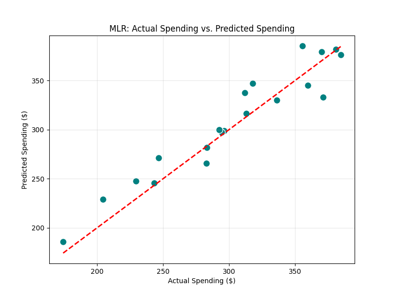
The teal dots represent customers. The closer they are to the red line, the more accurate our model is.
Gib den ersten Kommentar ab